“All the risks of climate change, in a single graph”
The risks of climate change are not easy to communicate clearly. Since the atmosphere affects everything, everything will be affected by its warming — there’s no single risk, but a wide and varied array of risks, of different severity and scales, affecting different systems, unfolding on different timelines.
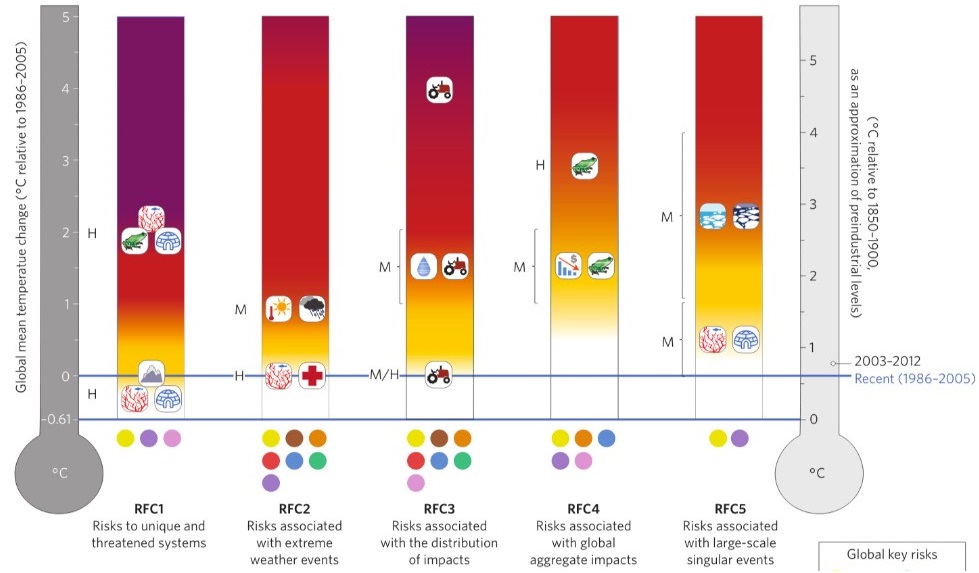
One of the better-known and more controversial attempts to address this problem is a graphic from the reports by the Intergovernmental Panel on Climate Change. The so-called “burning embers” graph attempts to render the various risks of climate change — “reasons for concern,” or RFCs — in an easy-to-grasp visual form.
Long story short, they find that the graphic is generally accurate (though it has key limitations). They offer suggestions for how the RFC framework could be extended in the future to “better account for possible changes in social and ecological system vulnerability.”
As you can see, there is a ton of information about the risks of climate change crammed in there, so it’s worth unpacking a bit. It offers a remarkably coherent overview of the various risks that lie ahead this century.
The thermometer on the right shows temperatures relative to preindustrial levels; the thermometer on the left shows them relative to 1986-2005. The distance between the two blue lines is warming that occurred through 2005. (As that note on the right indicates, warming is up a bit 2003-2012.)
Following the IPCC, risks are divided into five buckets or RFCs:
- Risks to unique and threatened systems. These are ecological or human systems that are geographically constrained and have a high degree of “endemism” — they are uniquely adapted to a particular geography and climate. The authors cite as examples “tropical glacier systems, coral reefs, mangrove ecosystems, biodiversity hotspots, and unique indigenous communities.”
- Risks associated with extreme weather events. This is what it says, i.e., “risk to human health, livelihoods, assets, and ecosystems from extremes such as heat waves, heavy rain, drought and associated wildfires, and coastal flooding.”
- Risks associated with the distribution of impacts. This reflects the fact that some groups will be hit earlier and harder than others. Distribution of impacts can be uneven with respect to “geographic location, income and wealth, gender, age, or other physical and socioeconomic characteristics.”
- Risks associated with global aggregate impacts. This refers to “impacts to socio-ecological systems that can be aggregated globally according to a single metric such as lives affected, monetary damage, number of species at risk of extinction, or degradation and loss of a number of ecosystems at a global scale.”
- Risks associated with large-scale singular events. These are the much-discussed “tipping points,” whereby a series of incremental changes pushes some system over a threshold, at which point it shifts into a period of rapid, discontinuous, and sometimes irreversible change. The iconic example here is “disintegration of the Greenland and West Antarctic ice sheets leading to a large and rapid sea-level rise.”
For more information on climate change and this “all-in-one” graph visit the source on Flipboard by David Roberts.
Comments are closed